


Google Mobile-First Indexing For New Sites
- Mobile-First,
- Indexing,
- Responsive,
What Is Mobile-First Indexing?
Mobile-first indexing is where Google crawls the mobile version of your site first (if there is one) and uses this version as the cached copy of your site on its servers.
It's important to note that there isn't a separate mobile-first index; Google search only uses one index and it will continue to show the most appropriate URL to users in search results (whether it's the desktop or mobile).
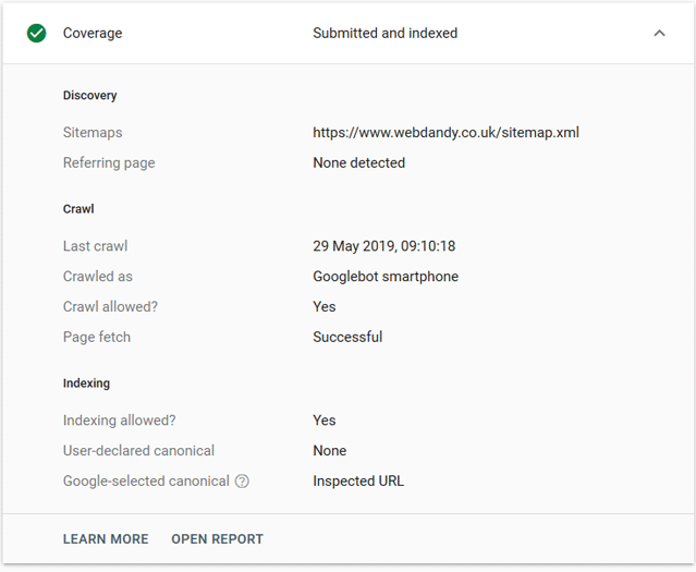
If you check which bot has accessed your site pages and if your site is mobile friendly, then Google webmaster tools should show the "Crawled as" field as Googlebot Smartphone. However if you don't yet have a mobile friendly version of your site then the desktop site will be the one that Google crawls and adds to its index.
Mobile-First Indexing Site Readiness
Google determines a site's readiness for mobile-first indexing based on whether the same content including text, links, images and videos; structured data and other meta-data e.g. meta tags, titles and descriptions; is present on the mobile site when compared to the desktop site.
Google has published a guide on how to "Prepare for mobile-first indexing" which covers best practice.
The Journey To Mobile-First Indexing
Google first talked about Mobile-first Indexing in November 2016, when they explained that: "To make [Google] results more useful, we've begun experiments to make our index mobile-first. We understand this is an important shift in our indexing and it's one we take seriously. We'll continue to carefully experiment over the coming months on a small scale and we'll ramp up this change when we're confident that we have a great user experience."
In December 2017 Google started evaluating websites to see if they were ready for mobile-first indexing. In December 2018 they then began to notify site owners that their site had been moved to mobile-first indexing. Mobile-first indexing started to roll out more broadly in March 2019. To help site owners prepare for mobile-first indexing Google published documentation.
Yesterday Google announced that mobile-first indexing will be enabled by default for all new websites and those previously unknown to Google Search, starting July 1, 2019 as their analysis has shown that new websites are more likely to be responsive (where your website has a flexible layout that adapts to the capabilities of many devices and screen sizes) in design and coding and hence ready for this method of crawling.
Google went onto say: "While we continue to support responsive web design, dynamic serving, and separate mobile URLs for mobile websites, we recommend responsive web design for new websites. Because of issues and confusion we've seen from separate mobile URLs over the years, both from search engines and users, we recommend using a single URL for both desktop and mobile websites."
Why Does Google Recommend Responsive Web Design?
Given that Google wants to deliver the best user experience when they use Google Search and more people are now using mobile rather than desktop browsing to view the web, a responsive website which is coded to work to mobile as well as desktop screen sizes enables the user to more easily access websites and the information they are looking for across a variety of devices without the user having to pinch and zoom.
Having a responsive web design is also recommended for a number of other reasons:
- Your site is easier to maintain as you only have one version of the site to update so the same content is served across desktop, tablet and mobile.
- Having one version of your site which uses the same content, images, scripts and style sheets can save on server bandwidth as Googlebot only needs to crawl each site page once rather than having to crawl it multiple times to index different versions of your site. Google also says that "this improvement in crawling efficiency can indirectly help Google index more of your site's content and keep it appropriately fresh."
- Having one version of your site means you only have to share and link to one URL and users don't have to be redirected to a device optimised view.
It's interesting to note that despite the advantages listed above, the number of responsive sites on the web is still quite low.
Do I Need To Make Any Changes To My Website?
If when your site was built it was coded to be "responsive" then you will not need to make any changes to take advantage of mobile-first indexing.
If your site is coded as a) desktop only or; b) a separate mobile version/different URL for desktop and mobile, you will see no immediate change. Google will continue to monitor and evaluate your site's pages for their readiness for mobile-first indexing, and site owners will be notified through Google's Search Console once they deem a site to be mobile-first ready.
John Mueller, Senior Webmaster Trends Analyst at Google stated that Google will communicate via Google Search Console to tell the webmasters what needs to be fixed to help the site migrate over to mobile-first indexing.
Does Mobile-First Indexing Affect Ranking?
There has been speculation as to whether site ranking will change or if mobile-first indexing will have an advantage in the search engine results pages. Some sites like Moz have published articles suggesting that "...the lack of a mobile-friendly experience could impact negatively on the rankings of that site, and a site with a better mobile experience would potentially receive a rankings boost even for searchers on a desktop."
However in a previous post in March 2018 "Rolling out mobile-first indexing" Google confirmed that "Being indexed this way [mobile-first] has no ranking advantage and operates independently from our mobile-friendly assessment. We may show content to users that's not mobile-friendly or that is slow loading if our many other signals determine it is the most relevant content to show."
Google's move to mobile-first indexing clearly signals that they are continuing their not so subtle push towards responsive websites rather than separate desktop and mobile site versions.
If your site is coded for desktop only and you'd like to make the move to a responsive website contact us for more information.